Trial and Error
If you eat something different at a culinary school, you’ll put it down as an experiment by the students, even if it tastes awful! Similarly, this pillar might look like a big mistake, but because it’s in design school, it can mean something else too!
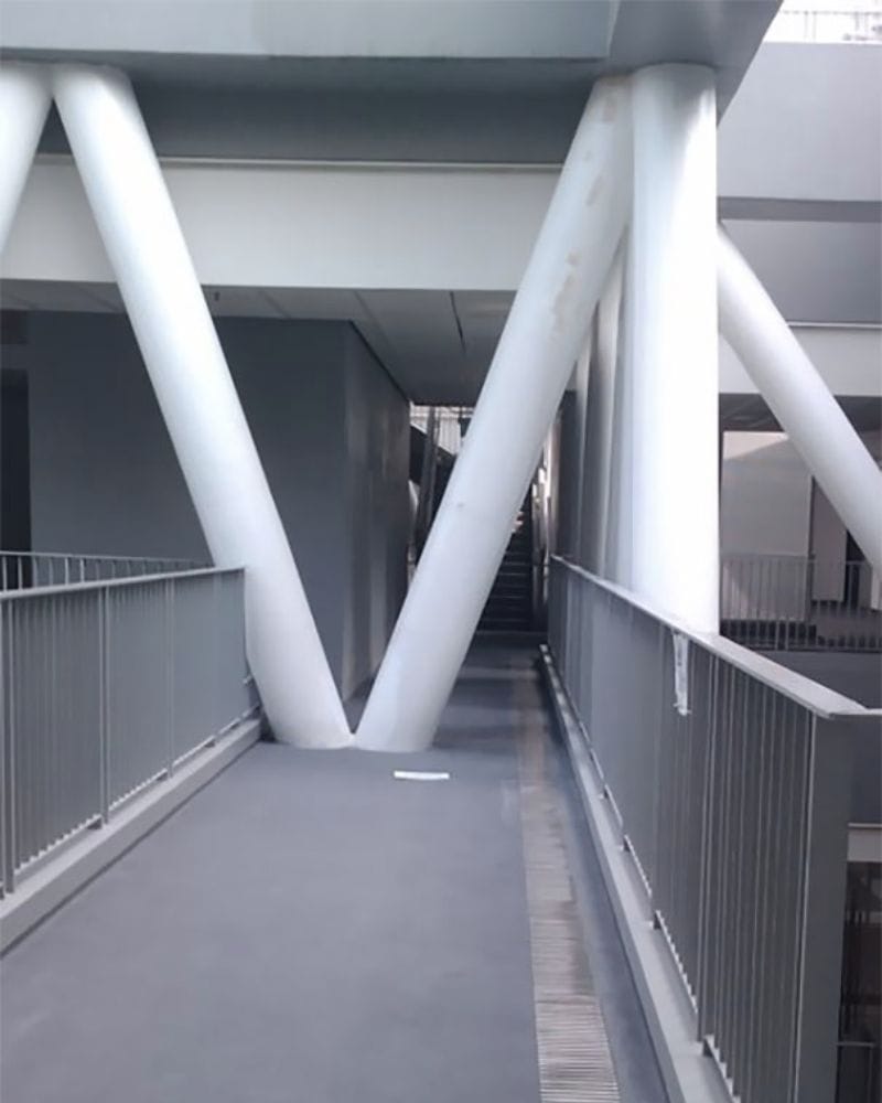
The architect’s behind this vision probably had something else in mind, as it’s hard to figure out a sensible reason why this pillar has found its way to the middle of the bridge otherwise. It has also caused quite a lot of debate between budding designers.
Only Tall People Get Money
Whoever this architect is, they probably carried a big grudge against the short people of the world. Why else, otherwise, would somebody come up with this design which allows only the tallest people to get their money from the machine?
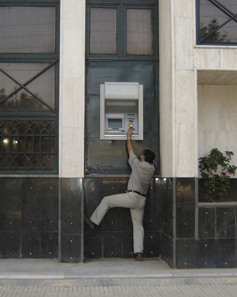
The least this designer could have done was add a few steps. Hopefully, the hobbits never find their way to this ATM; otherwise, Bilbo and Sam would have to undertake an entirely new quest — looking for stepladders!
An Island Among Water
We’ve finally discovered the place where the heroes in half-shell disappear to! Welcome to the homes of the Teenage Mutant Ninja Turtles! It’s not, though; otherwise, all teenage boys from the ’90s would be gathered around looking for Leo!

The architect behind this sewer might have given us a probable turtle location, but this is far from their best work. After all, this sewer seems to be doing everything but the job it’s supposed to.
Wrong Readings
It’s not only about looking at the designs and building precisely what’s on the plan. A good contractor should be able to use their brain and figure out when something is wrong.
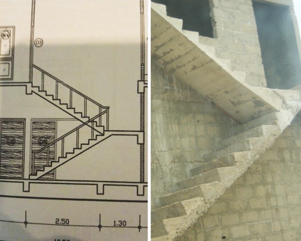
What they ended up building might be technically right, but it’s still absolutely wrong. People can only move up and down this staircase if it’s fixed ASAP. Architecture fail, for sure.
The Access Mystery
Who says you can’t have an IKEA-level display at a random motel? Well, this hotel certainly doesn’t play by rules — any rules. After all, why else would they have built a seating area with no access?
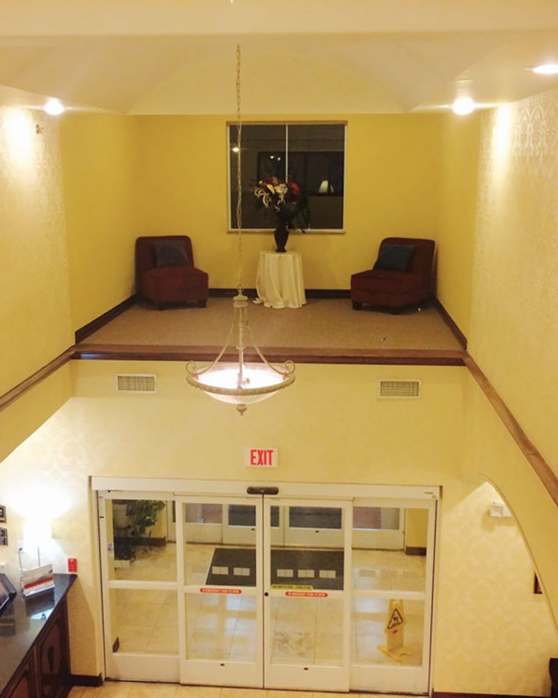
The seating area usually lies around the reception area and isn’t technically far, but a little too high to access. Unless you can get your hands on Aladdin’s magic carpet, you can say goodbye to ever getting a seat up there.
A Door to the Left
There’s a general rule of design that all architects have to follow. When creating the layout and the structure, the stairs always have to be situated so they can access the door. This architect still needs to get this memo, it seems.
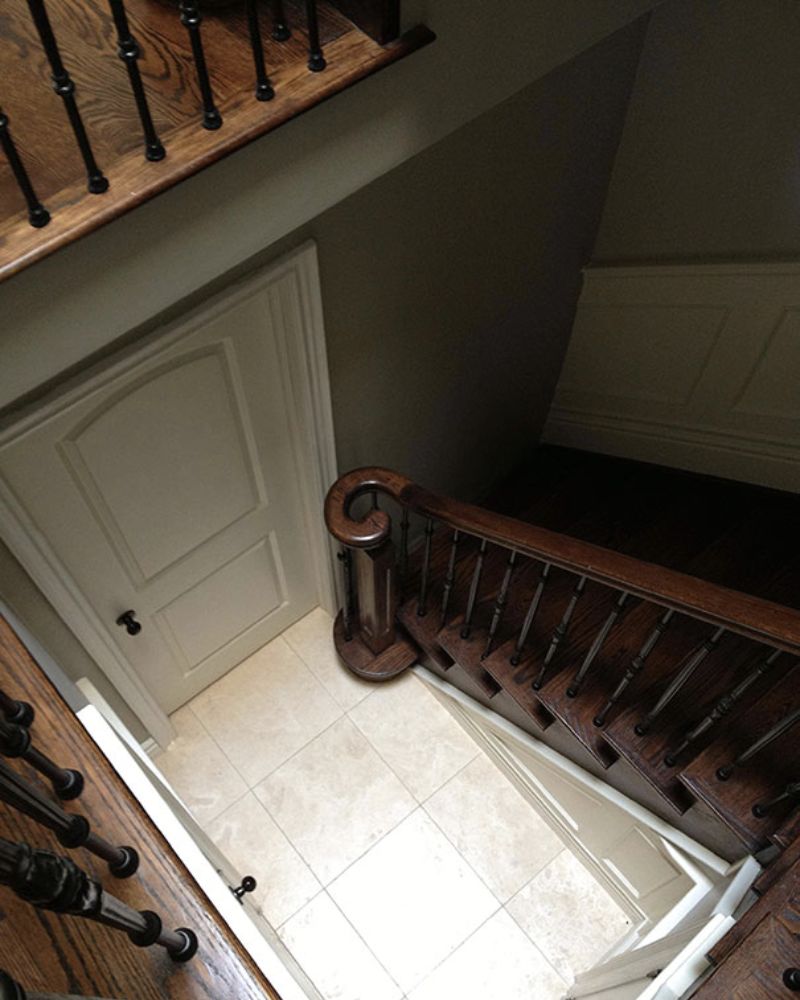
The only way to get into this house is to perform a jump right over the railing. Let’s hope it isn’t the door to Narnia because who needs the extra hassle to get to the magic land?
Schrödinger’s Staircase
This might not be the most accurate comparison, but the theory is that you must step onto one side to ensure each side can be both an exit and an entry! Such is the beauty, as well as the disaster, of this, randomly placed structure.
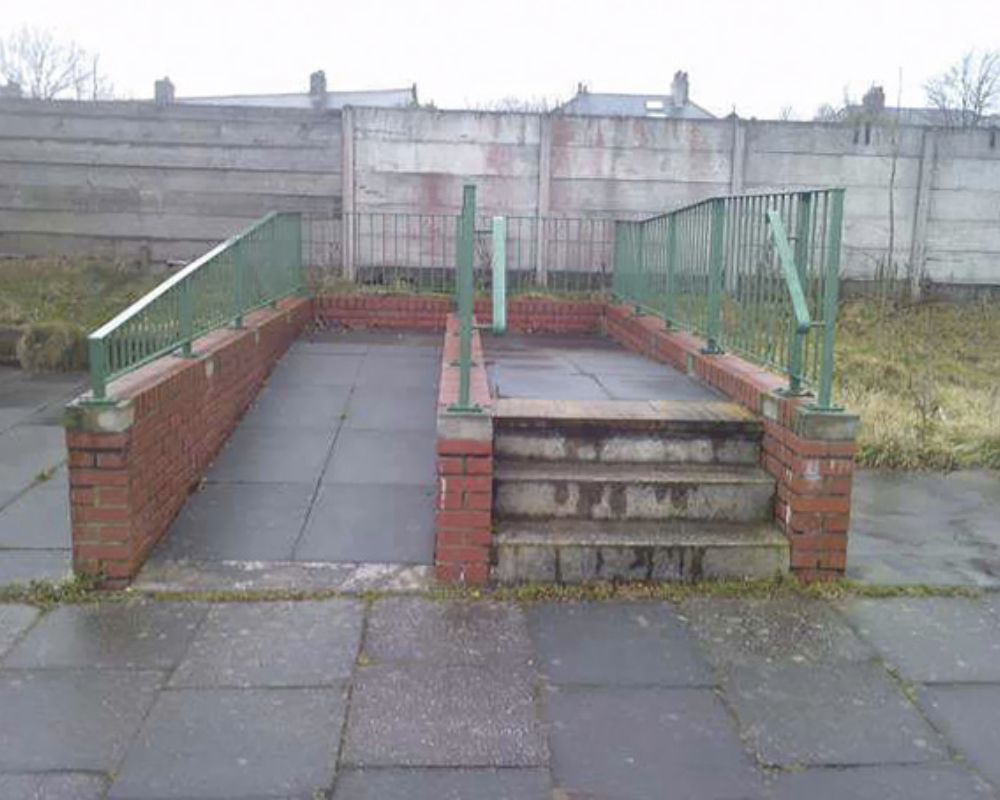
You’re not going anywhere; you’re not coming from anywhere. This is one of the times that the architect forgot to factor in the possible usefulness of the structure.
A Blinding Vision
A good seat at a stadium can make all the difference in how your match experience goes. Seats that give you a full-game view are the best, but what about these? What purpose do these seats serve?
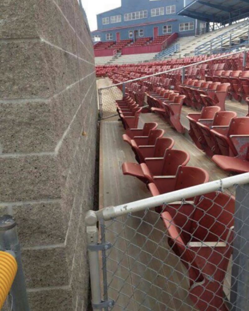
All you can see if you sit here is a huge wall. Even a small mounted TV would have been appreciated to give the viewers some semblance of being able to see the match.
Stuck in the Middle
Preparing an excellent structural design at the beginning of a project is very important. Why do you ask? We might not be able to tell you why, but we can show you what a lack of it can do.
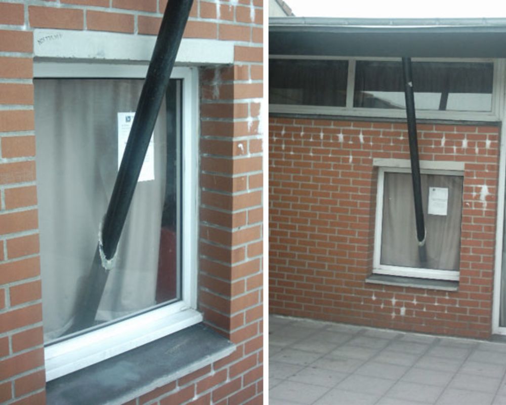
The only explanation for this beam coming out of the window is a definite lack of planning. Architecture is like a jigsaw puzzle, and every design flaw is a piece that doesn’t fit.
The Freshest Air
When you can’t decide whether you want a window or a balcony, you end up with a recipe for disaster right at your doorstep. The worst part is that the architect hasn’t given a small window above these open balconies but outright doors leading straight to the bottom.
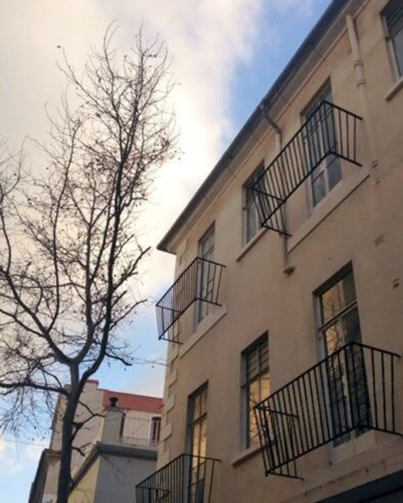
Well, at least there’s one good thing you could do with these fake balconies — when you have unwanted visitors at your house, you know exactly where you can take them for a bit of fresh air.
The Staircase to Nowhere
We’ve all heard the saying that where there’s a will, there’s a way. But it turns out it’s not always true. No matter how much ‘will’ you have, the most you can get from this staircase is ten steps up.
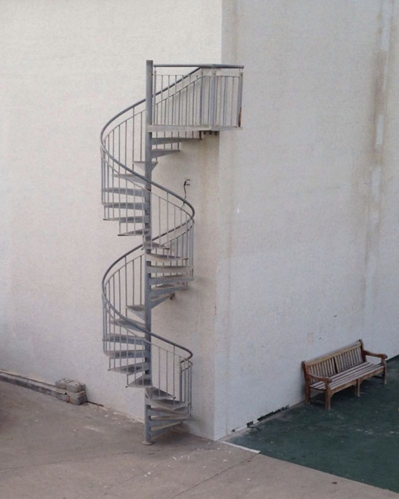
However, if you’re a group of kids wanting to play pirates and looking for a high point, this could be an excellent place to put your flag.
The Best of Both Worlds
There are some fundamental escalator rules. First and foremost, the stairs inside should be mechanical and move when you step. This architect, however, seemed to have missed that lesson.
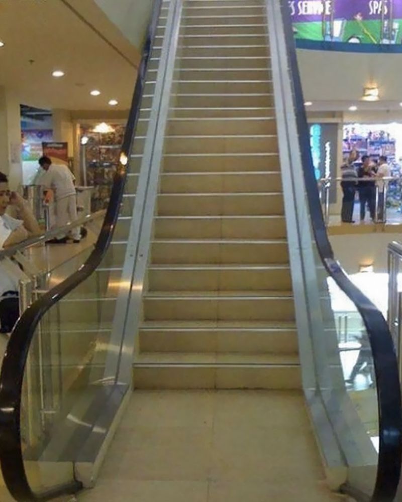
You might step on it expecting it to take you to the top, but you’ll be left waiting! The only good thing is you’ll have a good workout under the illusion of effortlessness.
The Best View
What are the things you check out when you look for a hotel room? The amenities, the bathroom, and the VIEW! All else might have been suitable for this person, but the room seems severely lacking in the view department.
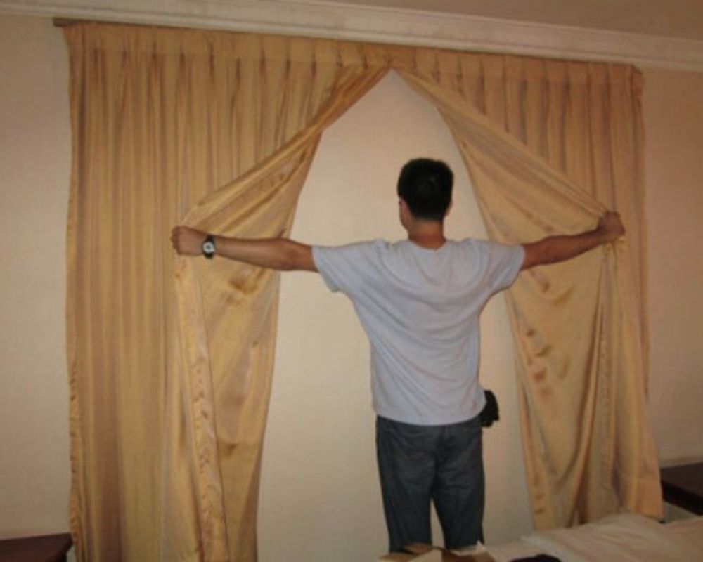
Who wants to stare at a wall of concrete in place of beautiful trees and scenic beaches? What really gets us is the fact that they decided to put up curtains as if that would convince guests that nothing is amiss.
The High School Door
Who do you blame when there’s an architectural issue in a high school? The architect, the principal, the board of trustees? Or maybe this is actually a learning opportunity for any kid who dreams of being an architect.
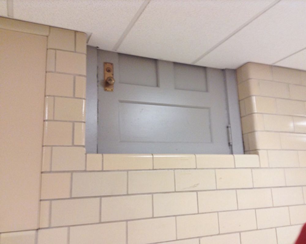
While this door is probably a really popular feature of the school with the students(probably for pranks or just general ridicule), we do hope that the school takes action soon to fix this.
Round the Clock
When planning a building, usually, the pipes go first, and the clocks come much later. But in this office, the clocks took precedence, and the lines followed suit. It’s not every day that you see a pipe that curves around.
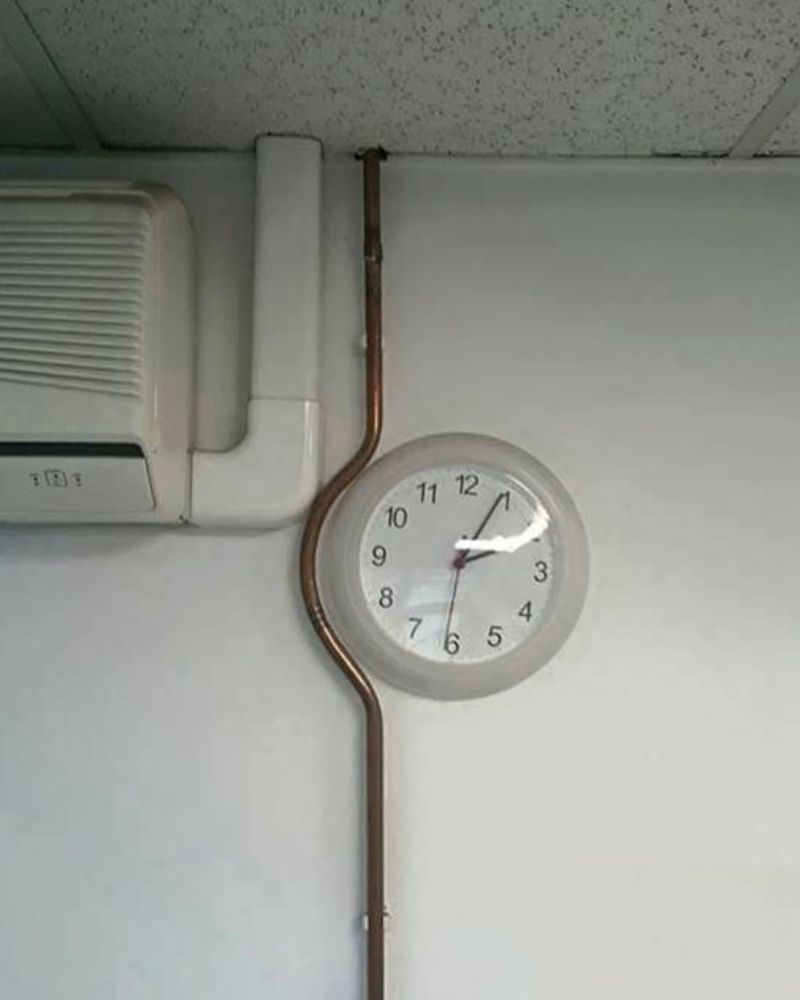
It’s an architectural marvel that the designers couldn’t move the clock but could bend the pipe to go around it. It’s a classic case of doing more to save some work.
Right Across the Balcony
There is nothing called privacy in these two buildings’ balconies. Even far-off jumping isn’t required to step from one house to another; you can easily climb through.
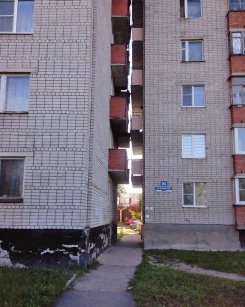
The design flaw is obvious, but it’s an excellent way for two friends to hang out. Imagine having your best friend right in the house next to you anytime you want to talk. Just holler (or whisper) across your balcony for a pow-wow.
Extension Gone Wrong
Just because someone has a degree and calls themselves an architecture firm doesn’t mean they’ll do an excellent job if you hire them. Look at what this man faced when he hired a company to add an extension fence to his property.
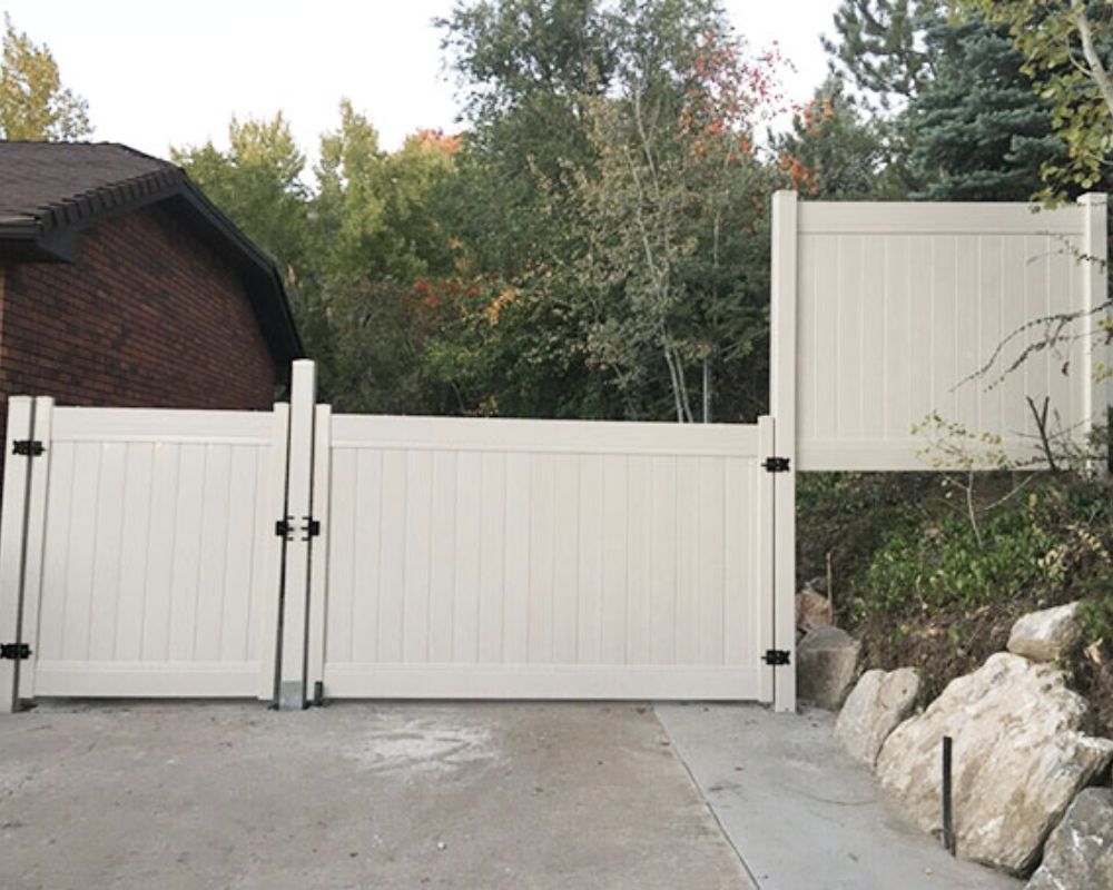
His son took to the internet to share the significant architectural failure! If you had a jumping car or a horse, this might have come in handy, but otherwise? completely useless.
Off the Charts
Those who don’t have a keen eye for design might completely miss this mistake, but trust us, you would still feel like something was a bit off if you were ever standing in this room.
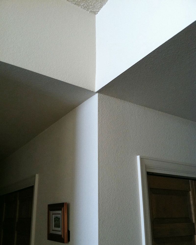
The edges of the wall and the ceiling must be appropriately aligned in the structure. It might be a minor issue, but it can ruin the entire aesthetic right away.
The Flying Car
You sometimes get what you ask for when it comes to architecture, like this person who probably asked for a car park but instead got one more suited to a jet.
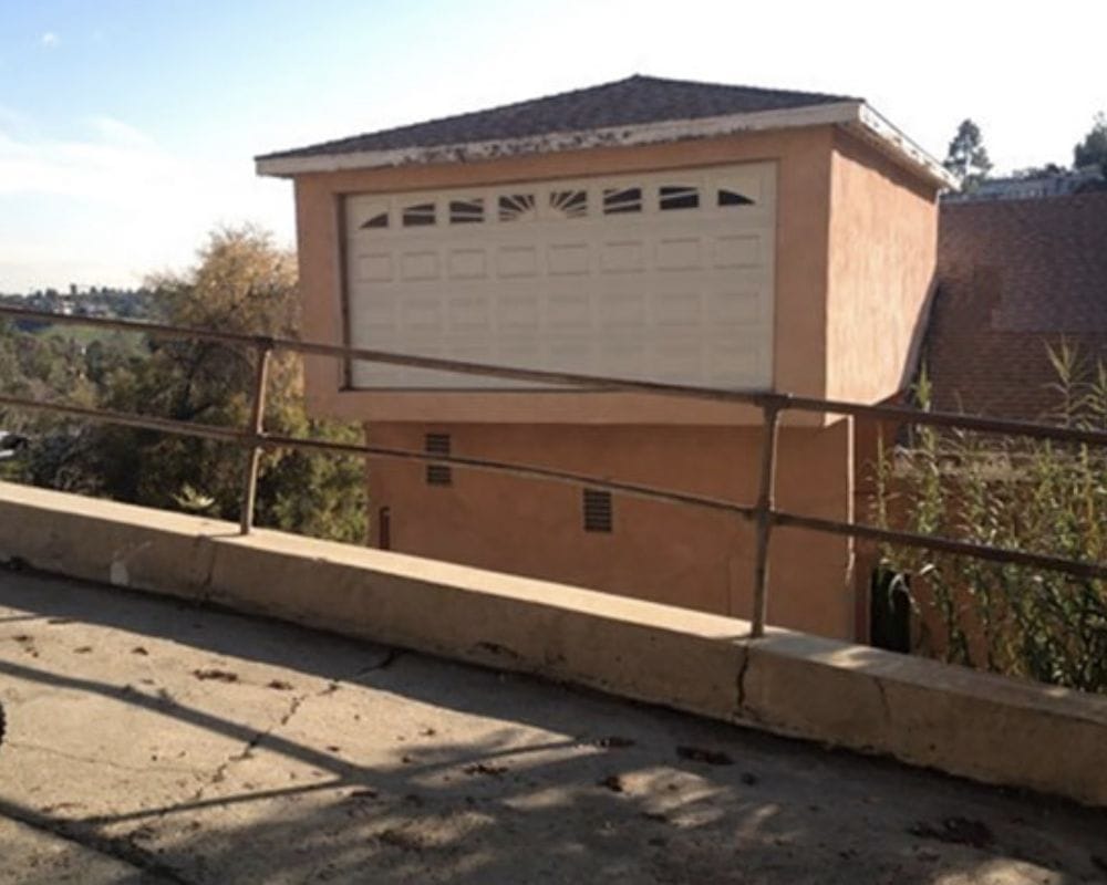
Unless this house belongs to Mr. Weasley or the Jetsons, we can’t see what good this place is to the homeowner.
Jump Over to Get Away
The staircase down to the exit door isn’t always smooth sailing; sometimes, the road is paved with obstacles you need to overcome.
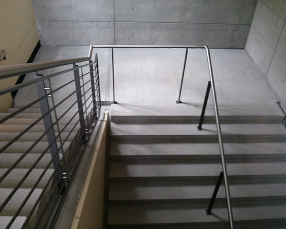
Anybody wanting to leave this particular building must go high or up to get out. It’s hard to figure out how it got to this, and even harder to understand why it wasn’t quickly fixed.
Pointless Balcony
The only people who can access this balcony are our friendly neighborhood flying superheroes. This balcony just isn’t made for mere mortals like us.
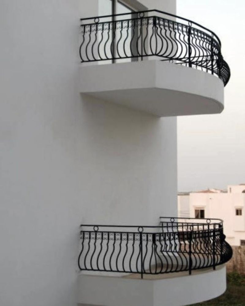
The question is whether the architect forgot to build the door or they had leftover material and decided to have some fun. Either way, it’s a perfect space for Spider-Man to hang out between his web-slinging adventures.
All by Its Lonesome
If you’ve ever felt lonely or a need to stand out, you probably know how this window feels. Amidst a colossal wall devoid of anything, this window hangs all by its lonesome.
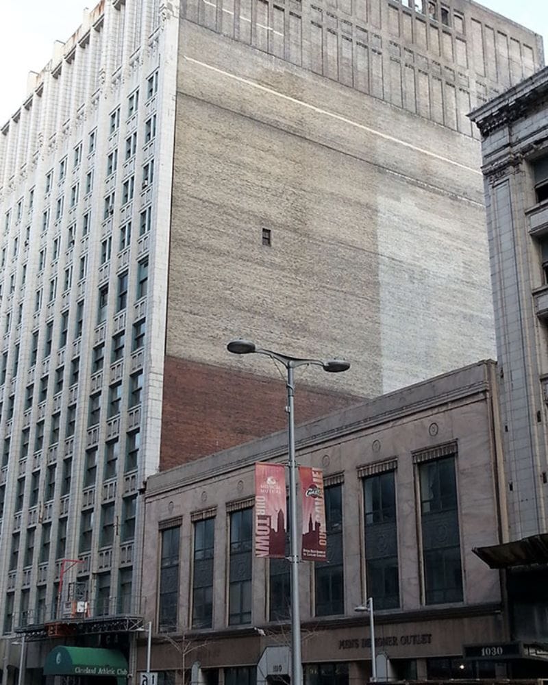
The office must belong to someone who had a critical need for a window in the middle of nowhere. Or, maybe it’s a spy room to see what’s happening on that side of the building.
Some Seating on the Side
If you’ve ever wanted to sit on stairs without being told to get up and move every ten minutes, these stairs might be it for you. They might not belong to the Met and make you feel all voguish, but they’ll give you some ‘me time’ without disturbance.
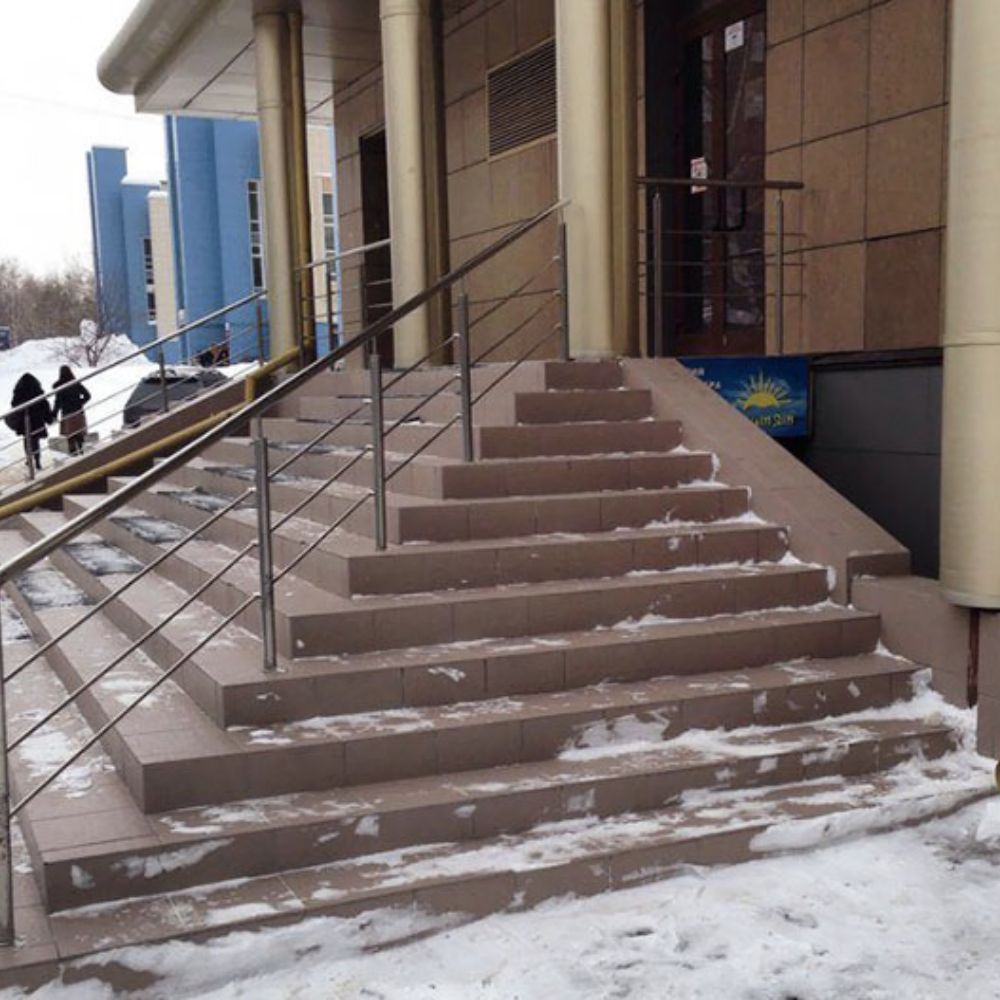
After all, who would go up these stairs, which lead to nowhere and are just an extension of the actually useful stairs? Truly the perfect place to take a breather.
Displaced Lightning
We know whoever lives behind this street pole probably hates it with a passion. After all, it’s a massive eyesore, and it completely blocks the garage’s accessible entrance.
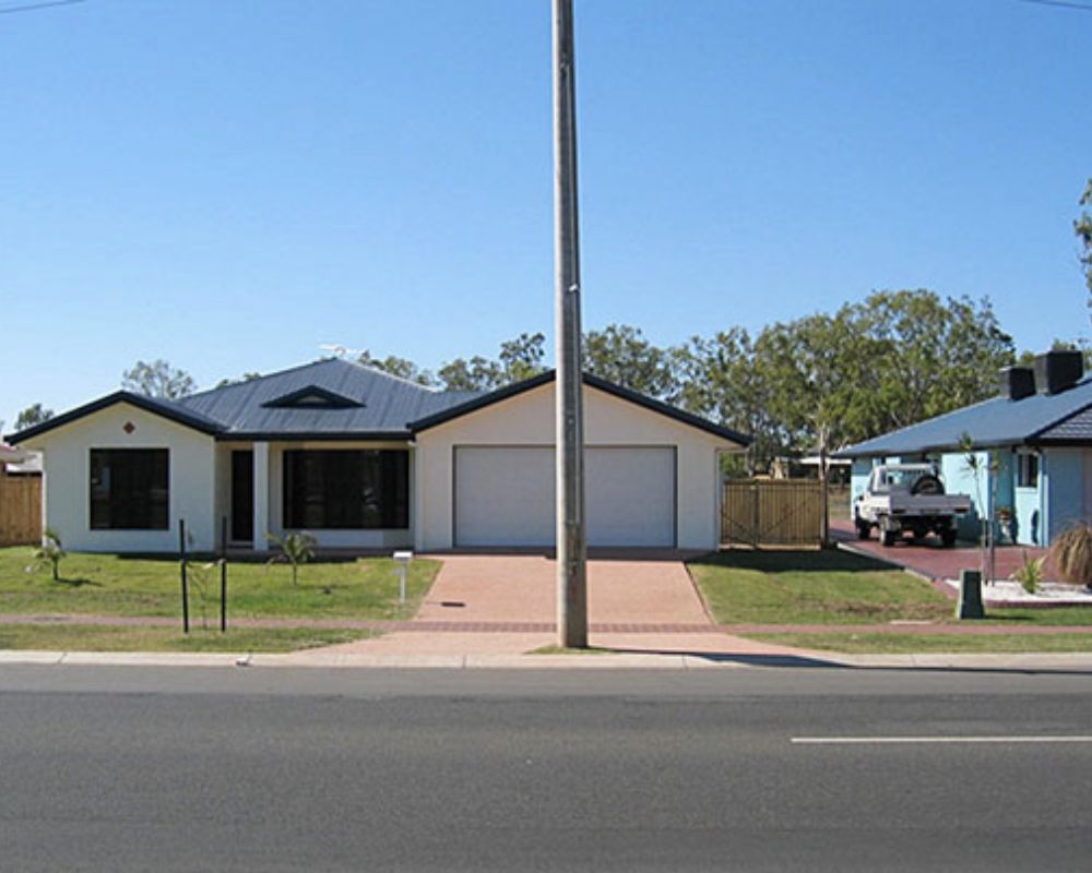
This pole is a screaming disclaimer of what you shouldn’t do because every-time anybody wants to get into the garage, they have to maneuver around it. We can only imagine the number of times the car has touched the pole to some degree.
Tetris Gone Wrong
This building looks like a puzzle that went wrong! From this list, it really does seem like more houses than should be normal have their parking in the air now.
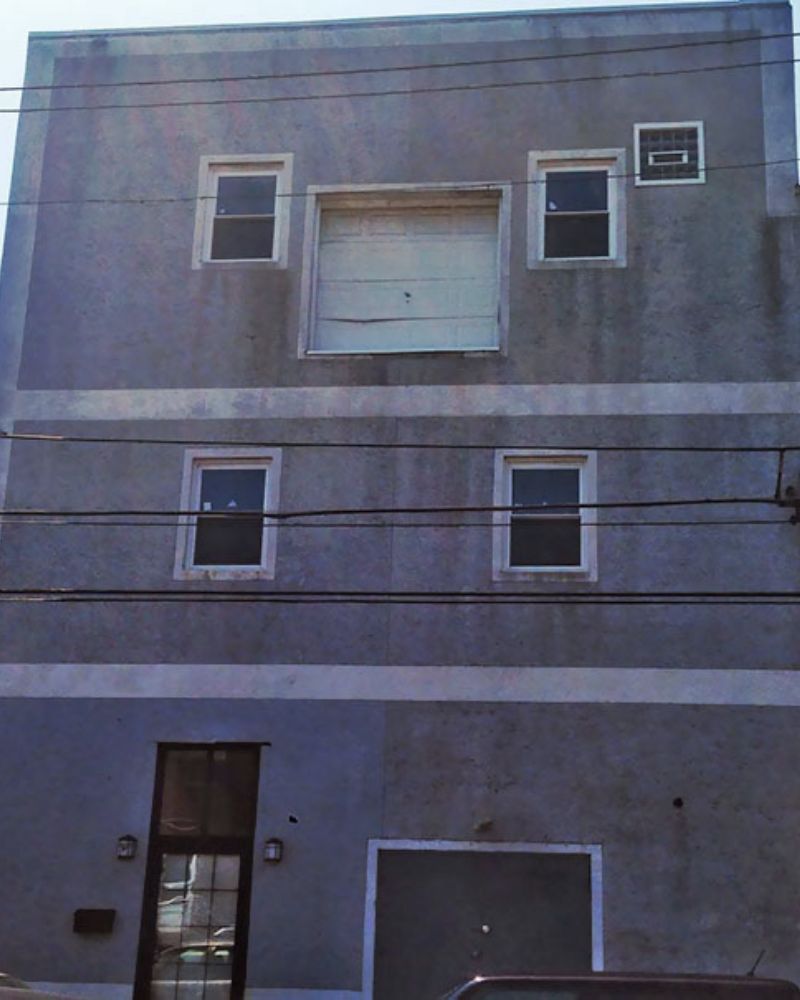
This building, which exists in the city of Philadelphia, has garage parking on the second floor. Not only is the door obsolete, but also dented. This is an example of architectural failure on a higher level!
Half and Half
All siblings, please take note of how to share the TV without any screaming matches. Just push it through the wall and pray that you both like the same channel in different rooms.
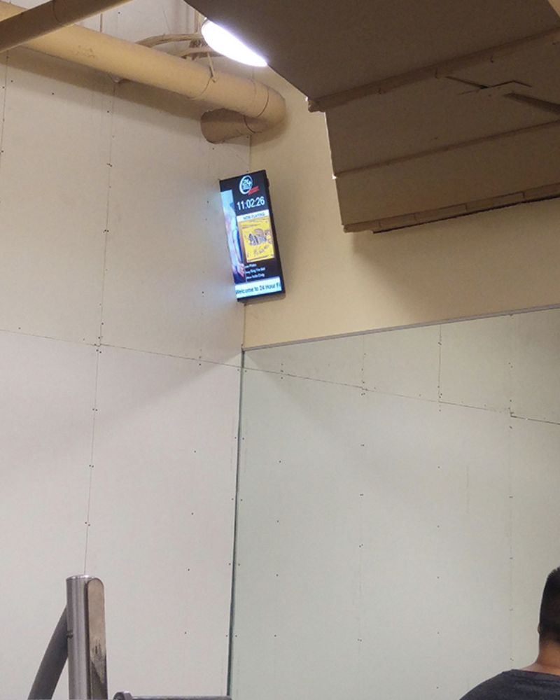
Architects worldwide have had some incredible outcomes of sharing spaces, but some have made big mistakes. After all, this TV is neither here nor there and will probably get destroyed within days.
Just for Posing
This staircase might not be able to fulfill its primary function, i.e., taking somebody someplace, but it’s rocking in its second one. It’s the perfect place to get a scenic, aesthetic photo!
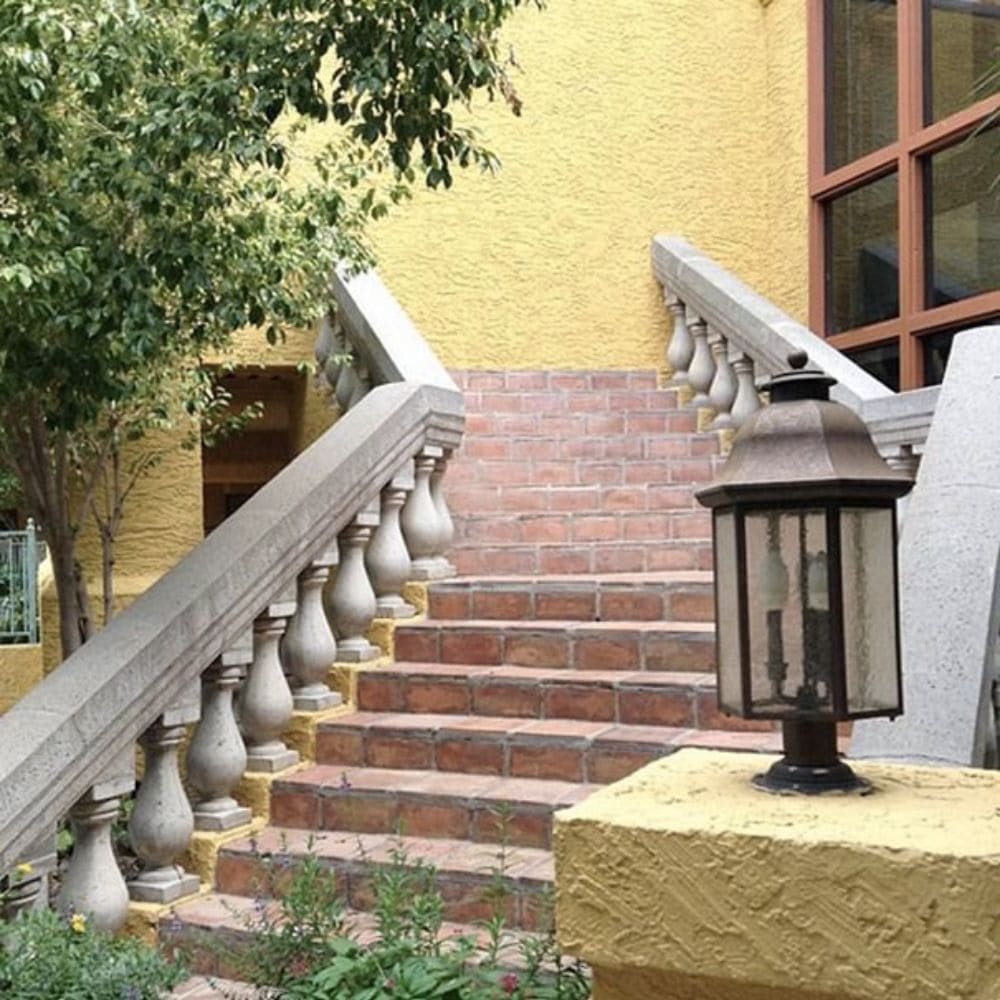
The yellow background, the green trees, and the beautiful brick-layered stairs all point to the perfect place to take your Instagram snap! It’s also a great place to take a romantic photo with your partner.
Some Down Before Up
The number of people who have thought bad things about this maze-creating architect must be many! Or, at the very least, we’re sure everybody living in the building is pissed off at the designer.
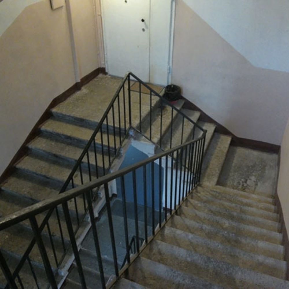
After all, who adds an upstairs when the person has already climbed down? Everyone who’s ever used a stairwell knows that there are way better ways to plan a staircase than this one out there.
High Door Days
Bolt this door and lock it because this is a hazard, not to your health but to your life. One step out, and it’s straight to the hospital. This just screams “bad planning!”
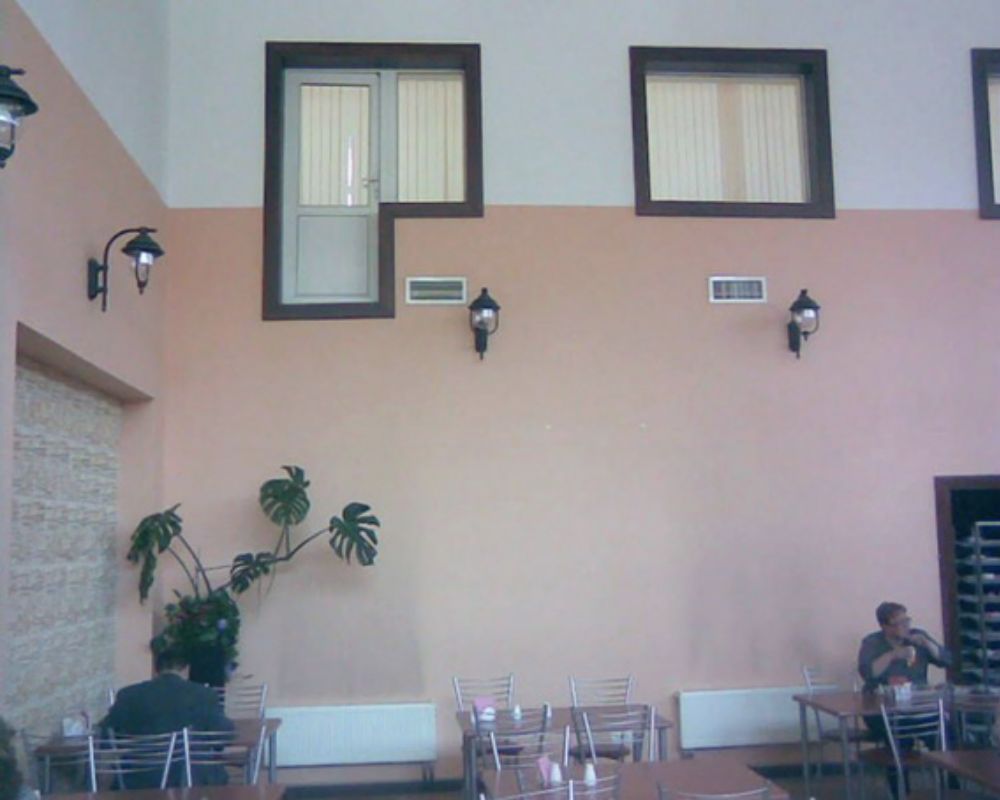
They could have wanted to add a staircase that led from the door to the bottom for easy access, but now it’s just useless. But if you’re into high jumps, this is an easy way to get to the cafe.
Just a Little Short
This McDonald’s falls just a little short when it comes to perfection. Of course, not in the food department, but in the architectural one. This particular column seems to have fallen short of reaching the ceiling.
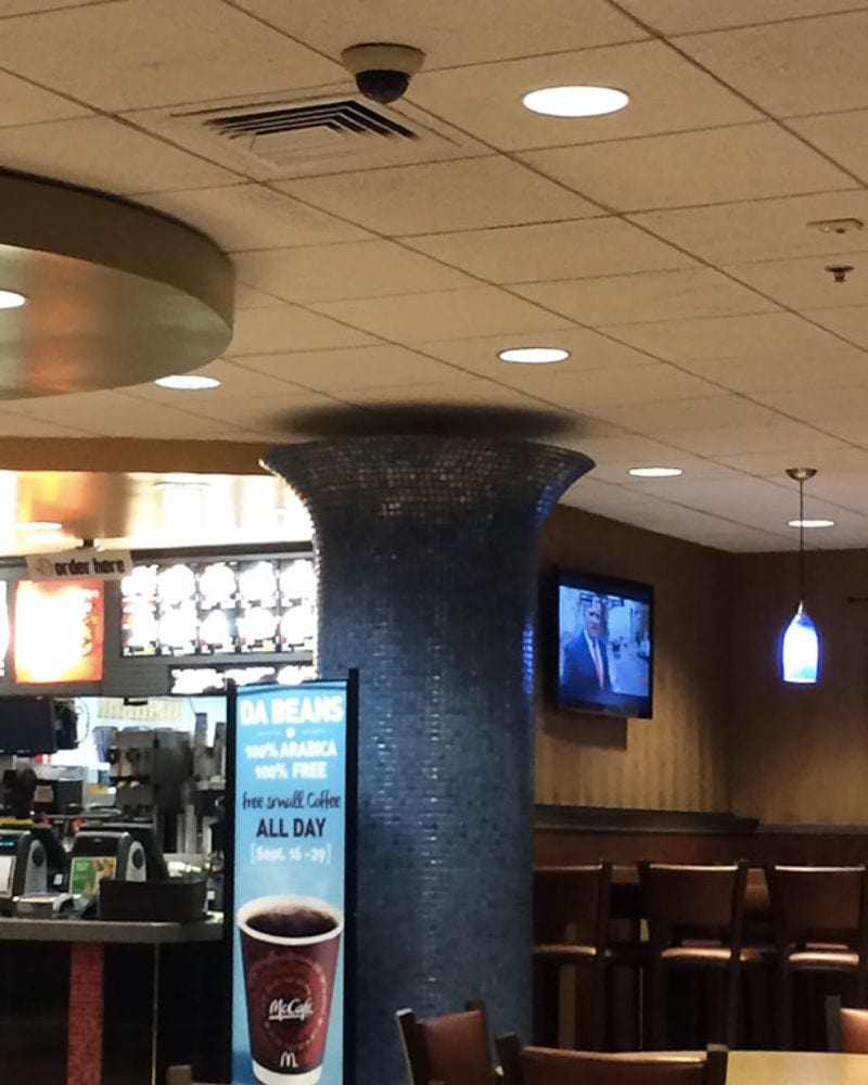
The restaurant team should shove some Big Macs up there, as those burgers are both delicious and indestructible.
Just for Appearances
Keeping up appearances is an essential aspect of any business. So when you can’t commit to 100% of it, you mostly have to end up winging it. It gives the illusion of power without you having to put in as much work!
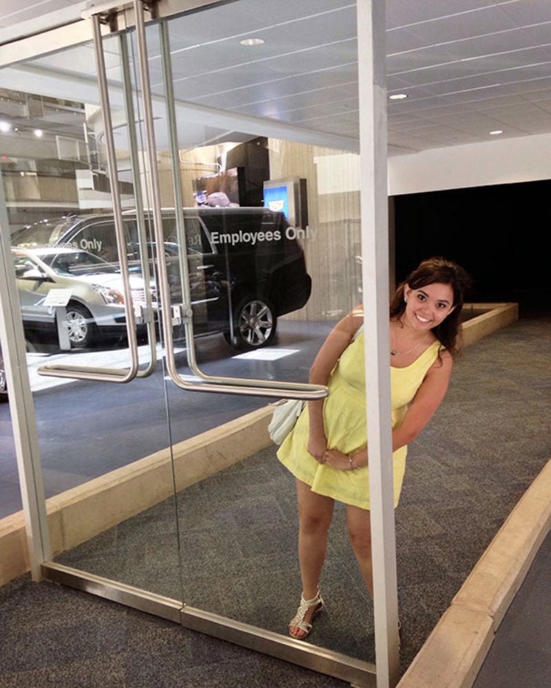
This automobile store’s power play includes putting a set of glass doors in the middle of the shop. They might be technically useless because you can step around, but they manage to convey the message.
Forever Closed
This architect completely forgot that once you shut drawers, you need to open them too. That’s why they put an entire column right in front of them, blocking all the paths to open them.
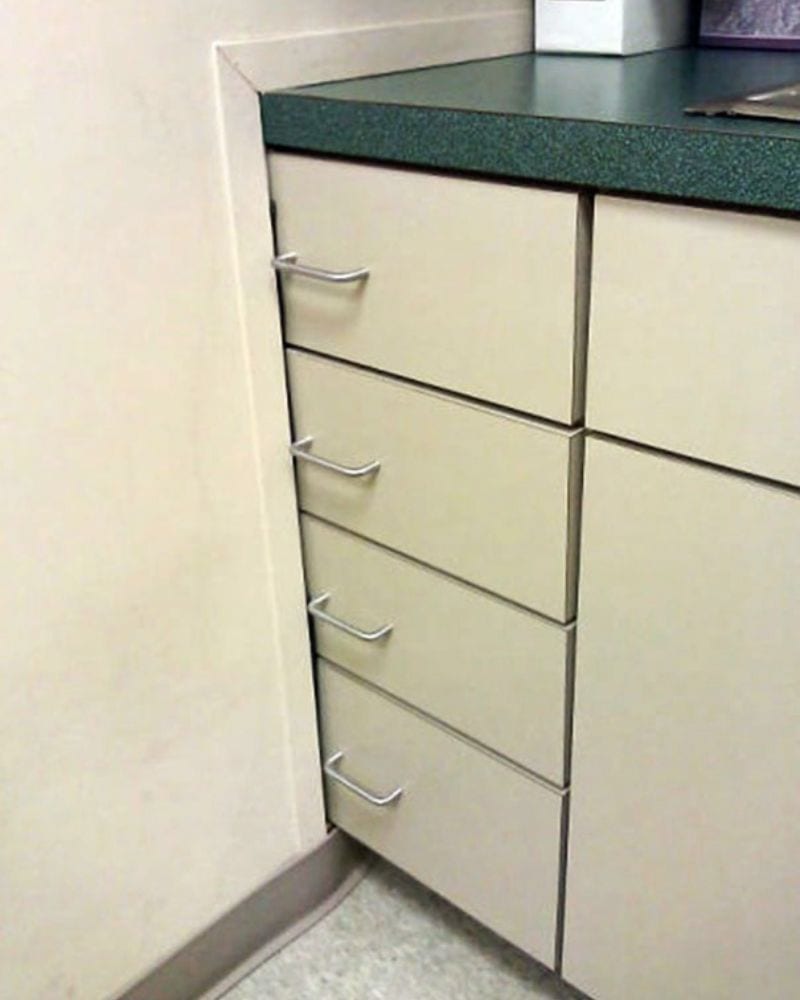
Let’s hope nobody had any essential documents like their chicken parmesan sandwich inside when they were sealed shut. Otherwise, the stench alone would be enough to clear the office out.
Aesthetics Over Function
Aesthetics have taken the front seat in construction, even more than functional usage and practicality. These beautiful arches could have meant something, but now they’re just there for your viewing and standing below for a quick pic.
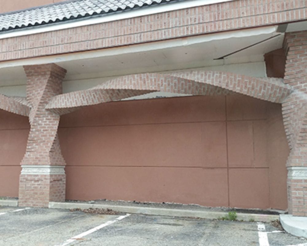
If only they had a door behind them, these arches would be a fantastic addition to the house instead of just unnecessary brickwork. A for effort, though — they really are very interesting to look at.
Half on, Half Off
Anybody who uses this door must be careful of coming and going because this door doesn’t play by the rules. Unlike other doors, which stand firmly on the floor, this one lives on the edge.
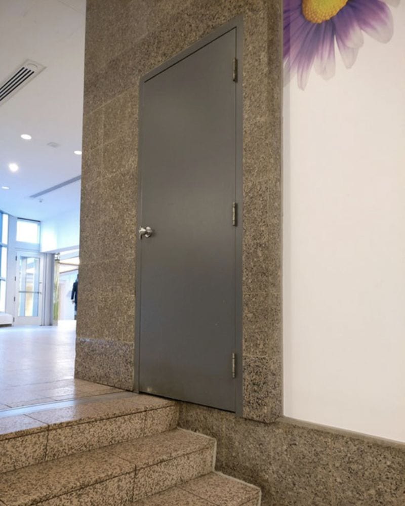
Half on and half off the stairs, people coming out of this door will have to step extremely carefully, or they’ll find themselves falling face-first onto the concrete.
Off-Roading for the Way
Usually, a gate in the middle of a walkway has to be right there, but this architect decided to push their door to the side and put it on the grass rather than the road itself.
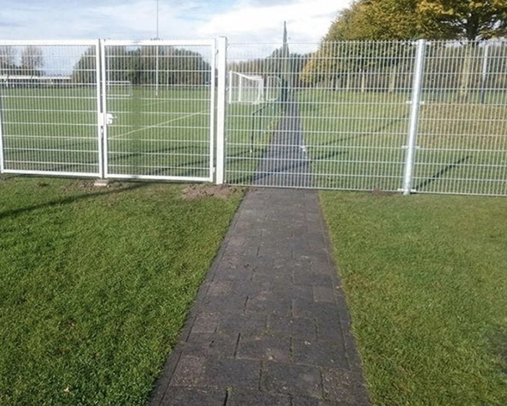
If you’re just walking on your feet, it’s fine. But if you’re somebody who’s riding a bike or anything else on wheels, this detour isn’t the easiest one.
The Upside — Down
Anybody looking to peek through this door might find that they need to stoop a little low, lower than they would have expected. It’s not a great way, or place, to see who’s standing on the other side of the door.
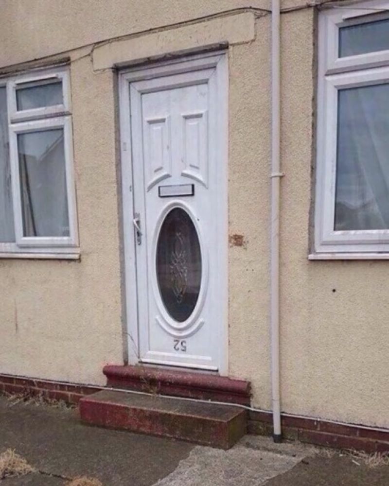
This problem, though, has a very easy fix — just turn your door upside down. But if you like making your life difficult, and keeping it adventurous, this is a good way to do it.
A Little Bit Lopsided
There might be a Leaning Tower of Pisa in Italy, but that doesn’t mean that the rest of the world is devoid of similarly tilted structures. Just take a look at this unique house.
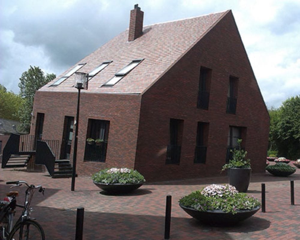
Meet its younger brother, who seemed to have had too much fun the night before and couldn’t stand upright anymore. This could be deliberate or a mistake, but we know nothing around this house could ever be counted as boring!
Not This Charger
To say outlets are especially essential nowadays is an understatement. In fact, some people actually choose their hang-out spots according to whether or not the place has outlets they can use to charge their phones.
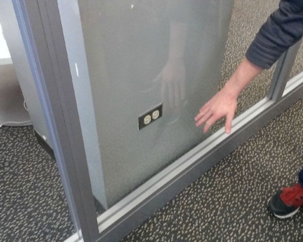
This architect decided to make the life of the millennials and gen-Z’s just a little bit tougher by making their outlets inaccessible. Everybody is just staring at those holes with longing!
Bricked Up
This window has no purpose, and it’s not because the view outside needs to be better. Blue skies, tall trees, we sure think it’s good enough. But it’s useless because there’s no way somebody can stand inside and take in the view.
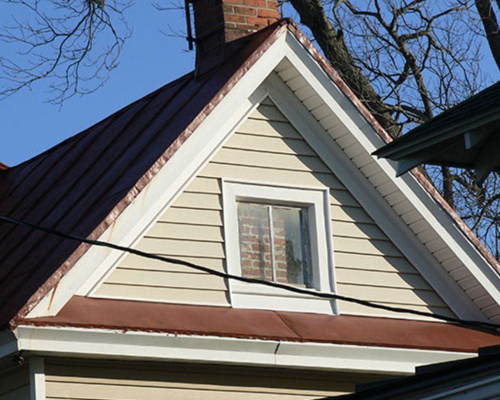
The inside of this window has been closed off heavily with bricks. Maybe this is Rapunzel’s house, and this is her wicked stepmother’s way of not letting her escape.
The Shared Balcony
If you’ve ever wanted to use a balcony as they do in action movies to go from one room to another, this could be the place for you to try it. This setup is easy, convenient, and suitably right outside the window!
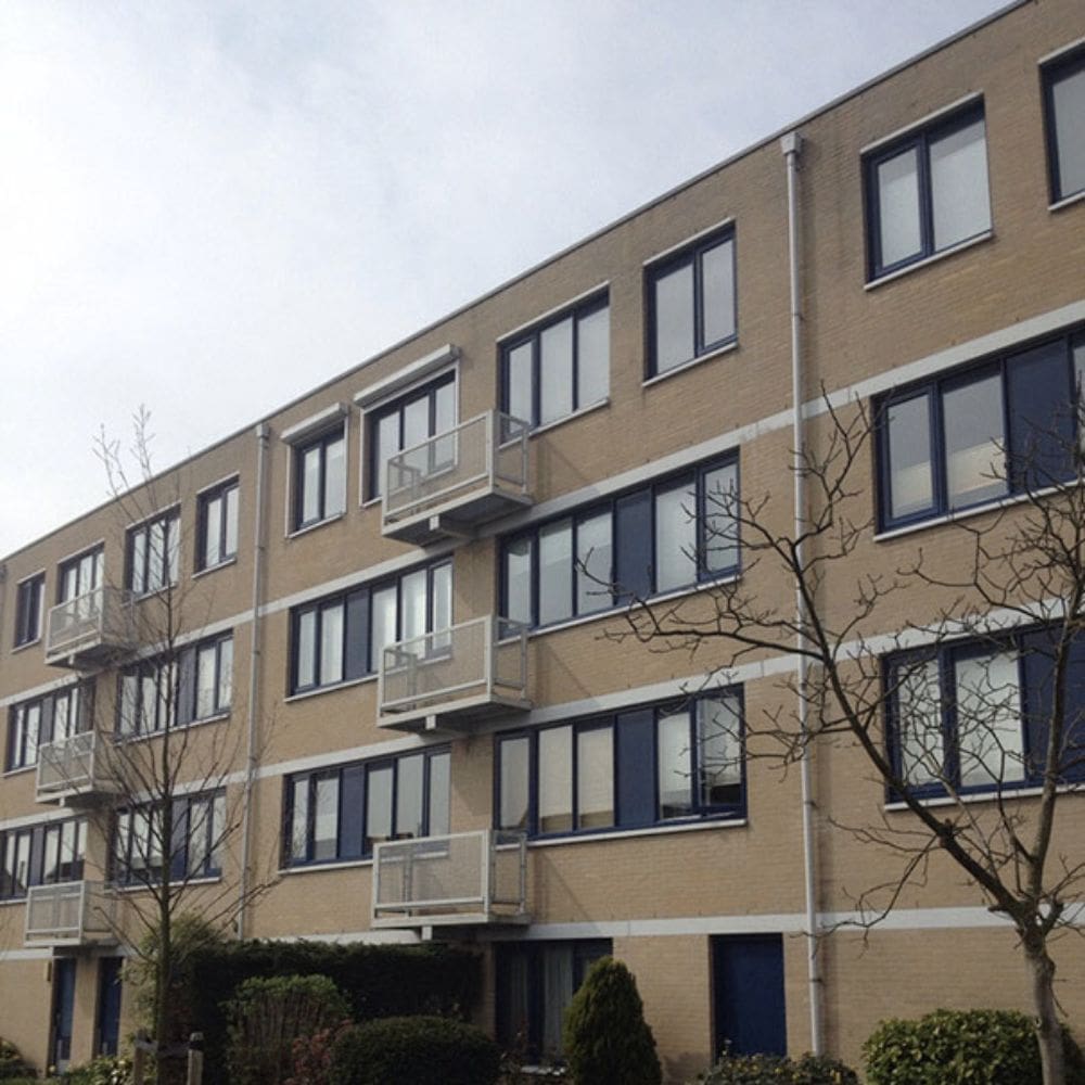
Technically, these balconies don’t make any sense because they’re neither here nor there. But they’ve probably been purposefully made this way to make life a little more adventurous.
Caution Needed
If you’ve tried to play a game where you have to stack things (like Jenga), you’ll know that getting your building aligned is more challenging than it looks. But this architect needed help even to get this straightforward staircase straight!
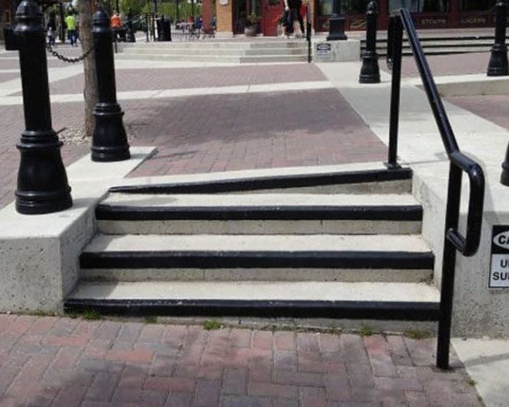
Let’s hope no rambunctious young boys or girls are running around trying to play tag in this park, or it could end with, at the very least, a twisted ankle.
No Turning Allowed
Driving a car requires all your concentration, but it also requires a well-made road. Unfortunately, the construction team sometimes forgets to follow all the rules and instead gives drivers something quite tricky to get around.
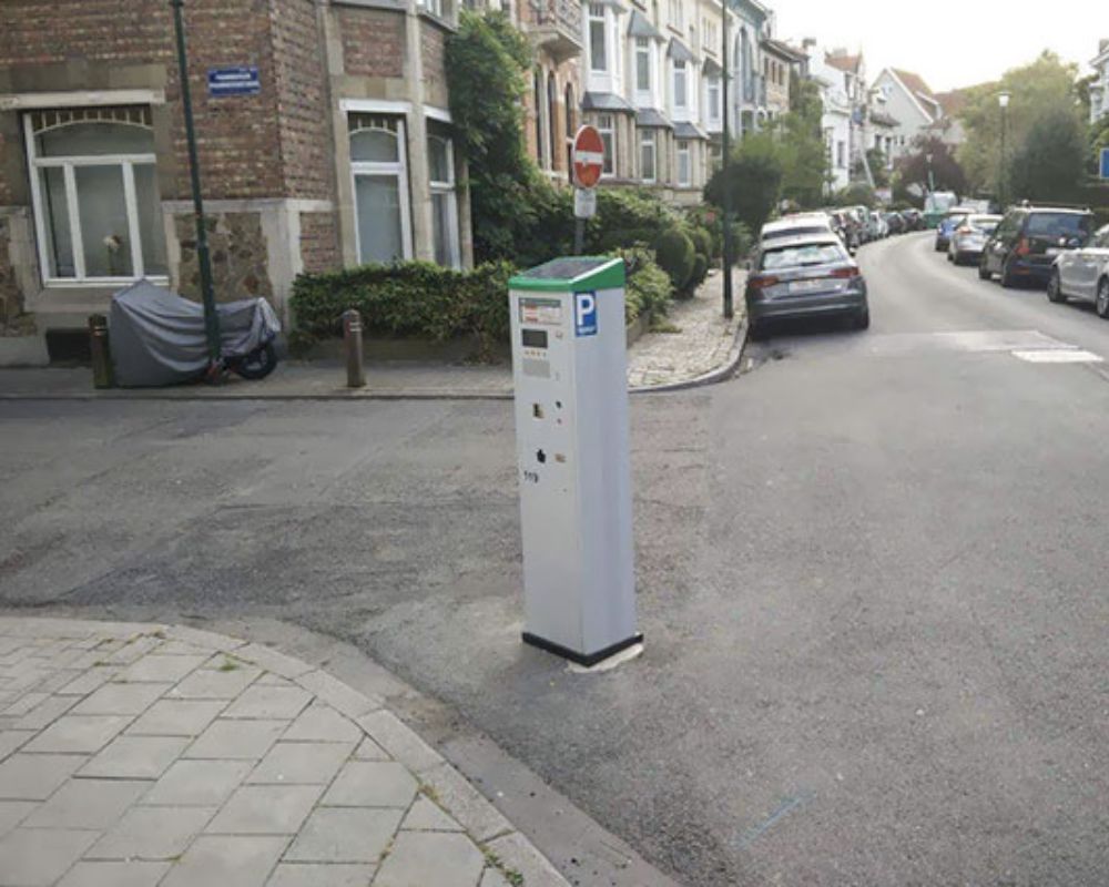
This parking meter is situated right in the middle of the turn and is an accidental hazard for any car driving on this road. Such a small mistake, such a significant impact!
A Rest Stop
If you’re getting a little too frustrated in your class or need an excellent place to unwind, this useless end to this staircase is a great place to go for exactly that. Residents of this building can easily sit there for some downtime, away from the world’s hubbub!
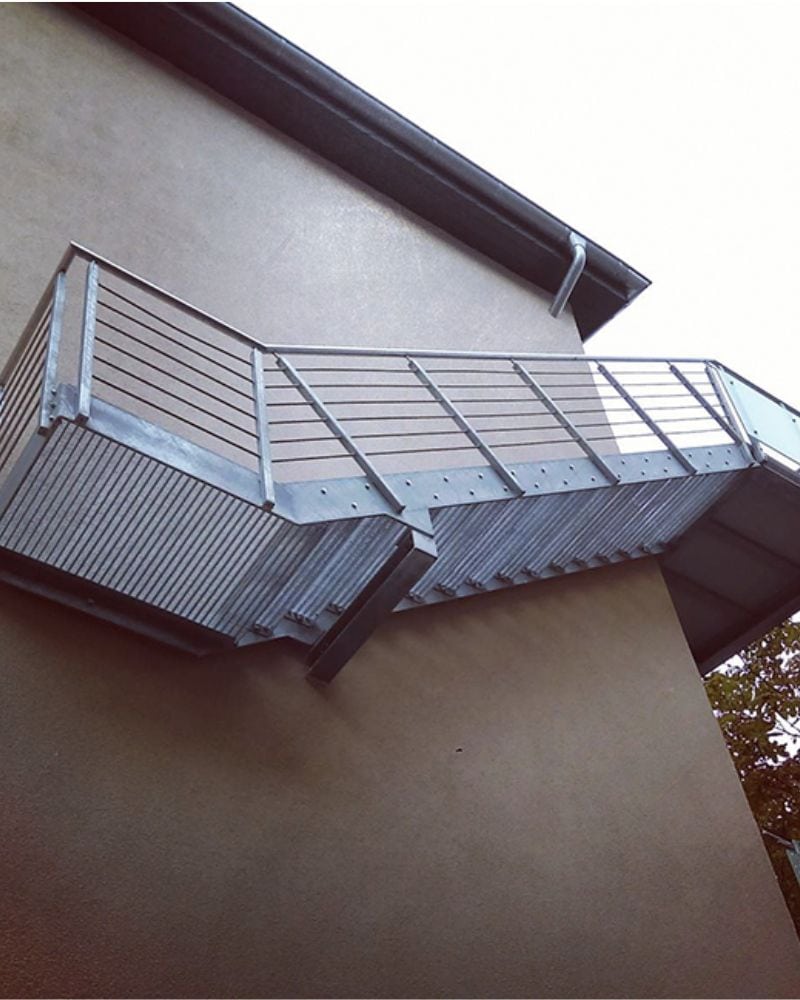
However, just because it seems like a good, unwinding place doesn’t mean it’s a good piece of design. After all, the whole point of a fire escape staircase is that it can act as a complete escape, and not just a mental one.
Don’t Sit With Us
A park bench conveniently located is a must for tired walkers, runners who need a breather, parents with babies in their arms, or lovers who want to sit together in silence.
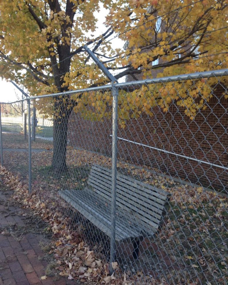
However, all these poetic musings are no match for this park bench’s positioning right outside the fence! A teacher wanting to give their students a timeout would love this one, but otherwise, it’s unwanted and non-feasible.
Neither Aesthetic Nor Useful
This door serves no purpose in this house — it’s neither aesthetically pleasing to the eye nor provides any functional usage. This house looks well lived in, but this door seems like a safety hazard for those living there.
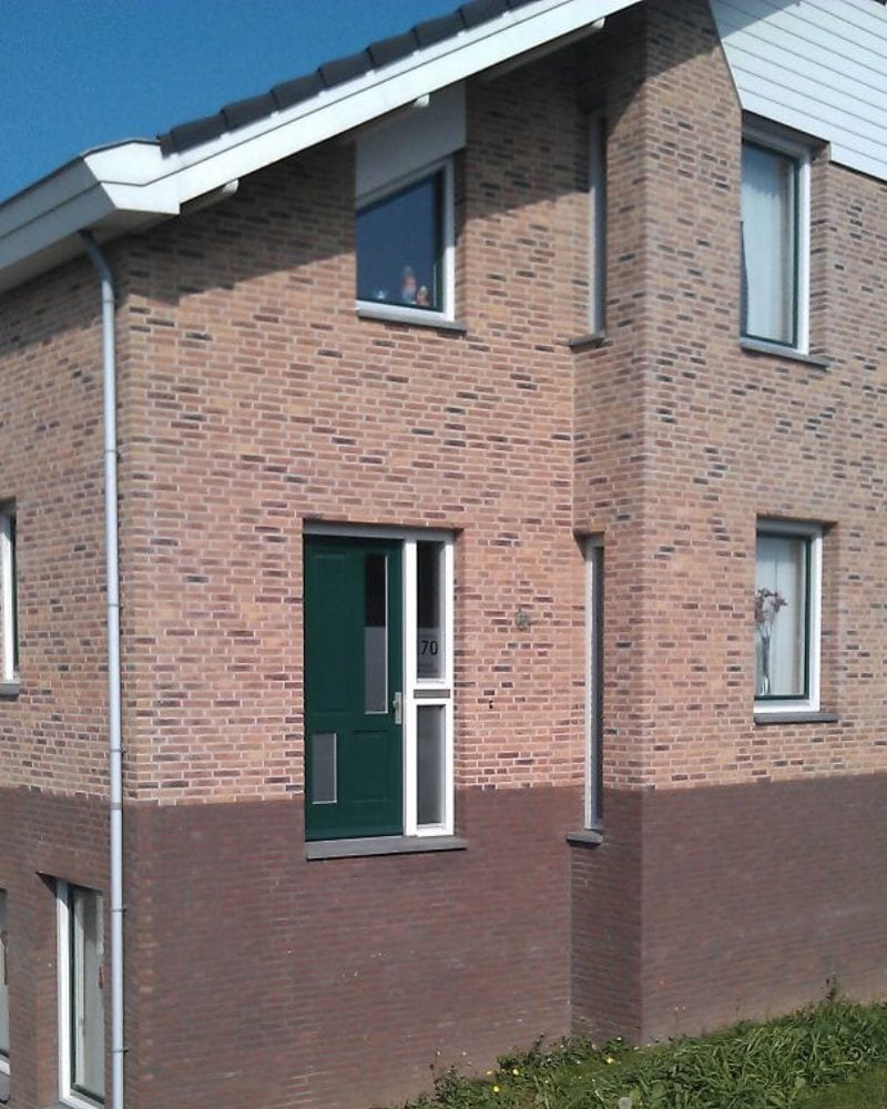
The only thing that can keep these people safe is a deadbolt on that door and a sign to keep them out forever and ever.
Architects can make beautiful designs come to life, as long as they solve all those major and minor construction issues. But sometimes, even the most obvious details are overlooked, and the end product turns out completely unusable. From stairs that go nowhere to doors on the nonexistent third floor, here are some of the most significant architectural fails that people have captured.